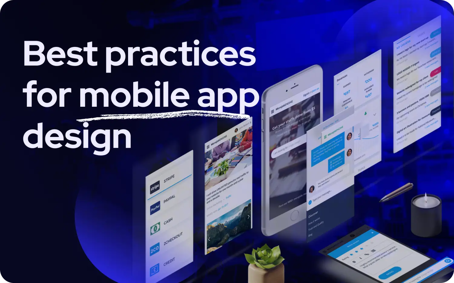
25 mobile app design best practices that will transform your user experience

We've all been there, you download an app that looks amazing in the screenshots, but the moment you try to actually use it, everything feels... off. Maybe the buttons are impossibly tiny, or you can't figure out how to get back to where you started. I remember downloading a banking app last year that looked sleek in the app store, but when I tried to transfer money, the buttons were so small I kept hitting the wrong ones, and the loading screens gave me no clue what was happening. After three failed attempts and nearly locking my account, I switched to their competitor's app within minutes.
This perfectly shows why good app design can make or break your business. It's not about fancy visuals or endless features, it's about creating experiences that don't make people want to throw their phone across the room. The following best practices will help you avoid the common pitfalls that drive users away and create mobile apps that people actually want to use, with a focus on outcomes rather than feature lists.
Understanding mobile app design evaluation criteria
Before you start implementing every cool design trend you see on Dribbble, you need a way to figure out what's actually worth your time. I've seen too many teams waste months perfecting features nobody asked for while their users struggled with basic tasks.
Here's a simple way to think about what actually matters when you're deciding what to work on first. Start with the problem or user desire, not screens or features. Focus on outcomes, not feature lists. You want to evaluate each potential design decision against seven key things: does it solve a real problem your users have, can you actually build it with your current team and timeline, will it make your app faster or slower, does it work the way people expect on their phones, can you tell if it's working, will it still make sense when you have more users, and can everyone use it regardless of their abilities. This becomes especially important when building an MVP app where every decision needs to balance what users need with what you can realistically deliver within your 4-week launch deadline.
| What to consider | Must have | Nice to have | Skip for now |
|---|---|---|---|
| User problems | Fixes something users complain about | Makes things a bit easier | Looks cool but doesn't help |
| Can you build it | Uses standard tools | Takes some extra work | Requires major custom development |
| App speed | Makes things faster | Doesn't slow things down | Might make app sluggish |
| Feels natural | Works like other apps | Pretty compatible | Confuses users |
| Can you measure it | Easy to track success | Some data available | Hard to tell if it's working |
| Growth ready | Works with more users | Neutral impact | Might break with scale |
| Everyone can use it | Required for legal compliance | Helps more people | Minor improvement |
Users drop off in cluttered or text-heavy UIs. Minimal screens and fast flows improve retention significantly. The data is clear: remove screens until nothing more can go, and avoid long texts by making the UI do the work instead.
User interface design fundamentals
Look, you can have the most amazing features in the world, but if people can't figure out how to use your app in the first 30 seconds, they're gone. These fundamentals aren't about making things pretty, they're about making things work the way people expect them to work.
When you get these basics right, everything else becomes so much easier. Whether you're working with professional UI/UX design services or figuring it out yourself, these are the non-negotiables.
For inspiration on how exceptional web design translates to mobile principles, explore our curated collection of 50 best website design examples that demonstrate many of these mobile-first fundamentals in action.
1. Make it obvious what's most important
You know when you look at a website and immediately know where to click? That's visual hierarchy at work. It's about using size, color, and spacing to guide people's eyes to the most important stuff first. Think about your banking app, your account balance should be the biggest thing on the screen, the transfer button should pop out with a bright color, and all the secondary stuff should fade into the background.
This isn't just about looking good, it actually reduces the mental effort people need to use your app. When someone opens your app, they shouldn't have to play "Where's Waldo" to find what they need. You can track whether this is working by watching how quickly people complete basic tasks and where they get stuck in your user flows.
Real example: Why Spotify gets this right Spotify's home screen is a masterclass in visual hierarchy. That big "Good morning" greeting immediately tells you where you are, your recently played music gets prominent cards because that's probably what you want, and all the discovery stuff stays smaller until you're ready for it. The green play buttons jump out against the dark background, while secondary actions stay subtle. You know exactly what to do without thinking about it.
2. Keep everything consistent
Here's something that drives me crazy: apps where the "Save" button is blue and round on one screen, then green and square on another. Consistency means if your main button looks a certain way once, it should look that way everywhere. Same goes for navigation, colors, fonts, everything.
This isn't just about being neat and tidy. When people learn how your app works on one screen, they should be able to apply that knowledge everywhere else. It's like learning to drive, once you know where the brake pedal is in one car, you don't want it to be somewhere different in every other car you drive.
Design consistency is critical for paid conversion. Research shows that inconsistent experiences dramatically reduce conversion rates to paid subscriptions, making this a must-have when planning your paywall strategy.
3. Design for thumbs, not fingers
My teenage nephew showed me how he navigates apps using only his thumb while walking. Watching him struggle with buttons at the top of the screen was an eye-opener. Most people hold their phones in one hand and use their thumb to tap things, which means the bottom third of the screen is the sweet spot.
Put your main navigation at the bottom, not the top. If you need a floating action button, stick it in the lower right corner where thumbs naturally rest. And for the love of all that's holy, make sure people can swipe to go back instead of having to reach for tiny back buttons in the corner.
4. Make text readable for everyone
This might sound obvious, but you'd be surprised how many apps get this wrong. Your text needs to be big enough to read without squinting, and it needs to get bigger when people adjust their phone's text size settings. Some people need larger text to see properly, and your app should respect that.
Use fonts that scale with the system settings, both iOS and Android have built-in ways to handle this. It's not just about being nice to people with vision problems; it helps everyone read your app in bright sunlight or when they're tired. Modern development tools make this pretty straightforward, so there's really no excuse not to do it.
No long texts, make the UI do the work. Users drop off significantly in text-heavy interfaces, according to UX research. Instead of explaining how something works, design it to be self-explanatory.
User experience and interaction design
Okay, now let's talk about how your app actually feels to use. This is where you go from "functional" to "delightful", or from "usable" to "I want to delete this immediately." It's all about how information reveals itself, how gestures feel natural, how the app responds to what people do, and how smart it is about giving people what they need.
5. Don't dump everything on users at once
You know that feeling when you open a new app and there are 47 buttons staring at you? Yeah, don't do that. Progressive disclosure is a fancy way of saying "show people what they need right now, and let them dig deeper if they want to."
Email apps do this really well, they show you who sent the message and the subject line, then you tap to see the full message if you're interested. Settings screens group things into categories so you don't have to scroll through every single option. It's like giving someone directions, you don't start with "turn left in 47 miles," you start with "head north for 2 blocks."
Research shows that minimal screens and fast flows improve retention dramatically. Remove screens until nothing more can go, this is particularly critical during your first 4 weeks of development to hit your launch deadline.
6. Use gestures people already know
Here's where things get interesting. People already know how to swipe, pinch, and tap from using their phones every day. Don't reinvent the wheel, use gestures the way people expect them to work. Swipe to delete items in a list, pinch to zoom photos, pull down to refresh content.
The key is sticking to what people already know. Instagram Stories nailed this, tap the right side to go forward, tap the left to go back, swipe up for more options. No learning curve required because it matches what people expect from watching videos anywhere else.
Why Instagram Stories navigation just works: Instagram figured out that people don't want to learn new gestures just to watch stories. Tap right to advance (like clicking "next" on anything), tap left to go back, swipe up for more options, and hold to pause. These gestures feel so natural that most people don't even think about them, they just work. Plus they added little progress bars and visual feedback so you always know what's happening.
7. Show users their actions worked
Nothing is more frustrating than tapping a button and wondering if anything happened. Every time someone interacts with your app, give them immediate feedback. Buttons should change color when pressed, show a little loading spinner when processing, and display a checkmark when something completes successfully.
This builds confidence. When people know their actions are being registered and processed, they're less likely to tap things multiple times or assume your app is broken. It's like nodding when someone is talking to you, it confirms you're listening and processing what they said.
8. Give people what they need, when they need it
Smart apps adapt to context. A weather app should show your current location first, not make you search for it. A music app might suggest upbeat playlists in the morning and chill ones at night. An e-commerce app could highlight recently viewed items or suggest related products.
This is where apps go from useful to indispensable. When your app anticipates what people need based on their location, time of day, or past behavior, it feels almost magical. Just don't be creepy about it, be helpful, not invasive.
Onboarding must educate and elevate. The first moments with your app should guide users to the core value without overwhelming them. Your onboarding should demonstrate your app's value proposition in action, not just tell people about features.
Performance and technical optimization
Nothing kills the mood like an app that takes forever to load. We're all impatient, if your app doesn't show me something useful in the first few seconds, I'm already thinking about deleting it. These practices are about making your app feel fast, even when it's doing complex things behind the scenes.
9. Show people something's happening when they're waiting
You know how Facebook shows gray boxes while your feed loads? That's way better than staring at a blank screen wondering if the app crashed. Skeleton screens give people a preview of what's coming while the actual content loads in the background.
This dramatically improves how fast your app feels, even if the actual loading time hasn't changed. It's like seeing the preview of a movie, you know something good is coming, so you're willing to wait a bit. Generic spinning wheels just make people anxious.
10. Make your images load fast without looking terrible
Images are usually the biggest thing slowing down your app, but there are smart ways to handle this. Use modern image formats that are smaller but still look good, only load images when people are about to see them, and show low-resolution versions first that gradually get sharper.
Instagram does this perfectly, you see a blurry version of the photo immediately, then it sharpens up as the full version downloads. It feels fast because you see something right away, even though the full quality image is still loading.
| Performance trick | How much it helps | How hard to implement | What users notice |
|---|---|---|---|
| Skeleton screens | Big improvement | Pretty easy | App feels much faster |
| Lazy loading images | Big improvement | Moderate effort | Pages load way faster |
| Offline content | Medium improvement | Takes some work | Works without internet |
| Smaller app size | Medium improvement | Moderate effort | Faster downloads |
| Progressive images | Medium improvement | Pretty easy | Images appear faster |
| Code splitting | Big improvement | Takes some work | App starts up faster |
11. Make your app work when the internet doesn't
We've all been there, you're on a train, in an elevator, or just in a dead zone, and suddenly every app stops working. Smart apps cache important content locally so you can still do useful things even without a connection.
Google Maps lets you download areas for offline navigation. Note-taking apps save your drafts locally and sync when you're back online. Social media apps show you cached content with a little "offline" indicator. The key is being transparent about what's available offline and what needs an internet connection.
12. Keep your app lean and mean
Nobody wants an app that takes up half their phone's storage or drains their battery in two hours. Use vector graphics instead of multiple image files for icons, remove features and assets you're not actually using, and split your app so people only download the parts they need.
This is especially important for people with older phones or limited data plans. If your app is a 200MB download, you're already excluding a chunk of potential users who can't or won't download something that big.
Focus on outcomes, not feature lists. Your first version should ruthlessly prioritize the core user journey. App Store success depends more on UX clarity than feature count, according to industry research.
Accessibility and inclusivity
Accessibility isn't just about checking compliance boxes, it's about not accidentally excluding your users' parents, friends with vision problems, or anyone using your app in bright sunlight. When you design for accessibility from the start, you usually end up with solutions that help everyone.
13. Make sure everyone can actually read your text
This goes beyond just making text big enough. You need enough contrast between your text and background colors so people can actually read it. The official standard is 4.5:1 contrast ratio for normal text, but honestly, just ask yourself: "Can I read this in bright sunlight?"
Don't rely only on color to communicate important information. If your error messages are just red text, colorblind users might miss them. Add icons, underlines, or other visual cues that don't depend on seeing specific colors.
14. Work with screen readers
Blind and visually impaired users navigate apps using screen readers that speak the content out loud. This means your images need descriptions, your buttons need clear labels, and your content needs to be organized in a logical order.
Instead of a button labeled just "Submit," make it "Submit order" or "Send message." Rather than an image with no description, add text like "Product photo showing blue running shoes." It's pretty straightforward once you get in the habit, and modern development tools make this easier than ever.
15. Design for people with different abilities
If users need a magnifying glass to tap your buttons, you've missed the mark. Touch targets should be at least 44 points square (that's about the size of a fingertip), with enough space between them so people don't accidentally tap the wrong thing.
Some people can't do complex gestures like pinch-to-zoom or multi-finger swipes. Always provide alternative ways to access the same functionality, like zoom buttons alongside pinch gestures, or menu options for things that normally require swiping.
16. Welcome users from around the world
If you're planning to expand globally, design for it from the start. German text takes up about 30% more space than English, Arabic and Hebrew read right-to-left, and colors mean different things in different cultures (red means luck in China but danger in the US).
Build flexible layouts that can handle longer text, support different text directions, and be thoughtful about imagery and color choices that work across cultures. It's much easier to plan for this upfront than to retrofit your entire app later.
| Accessibility feature | Compliance level | How important | What it helps with |
|---|---|---|---|
| Color contrast (4.5:1) | WCAG AA | Must have | Everyone can read your text |
| Touch target size (44pt) | WCAG AA | Must have | Prevents accidental taps |
| Screen reader labels | WCAG AA | Must have | Works with assistive tech |
| Keyboard navigation | WCAG AA | Nice to have | Alternative input methods |
| Focus indicators | WCAG AA | Nice to have | Shows where you are |
| Image descriptions | WCAG A | Must have | Explains visual content |
| Video captions | WCAG AA | Nice to have | Hearing accessibility |
Navigation and information architecture
Now, this might sound obvious, but you'd be surprised how many apps get this wrong. Good navigation is invisible, people should be able to find what they need without thinking about your menu structure. Bad navigation makes people feel lost and frustrated, like being in a maze where all the hallways look the same.
17. Make navigation predictable
Stick to patterns people already know. Put your main sections in a bottom tab bar, use a hamburger menu for secondary options, and make sure the back button always works the way people expect. Don't get creative with navigation, get creative with your content.
Keep your navigation consistent across all screens. If "Settings" is in the bottom right on one screen, it should be in the bottom right everywhere. People shouldn't have to relearn how to get around your app on every screen.
18. Help people find what they're looking for
For apps with lots of content, search can make or break the user experience. Make your search easy to find, show suggestions as people type, remember what they've searched for before, and handle the inevitable "no results" scenario gracefully.
Don't just throw up your hands when someone searches for something you don't have. Suggest alternatives, show popular items, or help them refine their search. It's like being a helpful store clerk instead of just shrugging and walking away.
Why Airbnb's search actually works: Airbnb handles complex search requirements without making you feel overwhelmed. You start simple, where do you want to go and when, then you can add filters for price, amenities, and property type if you want. The results update in real-time, you can see active filters as little chips, and the map view helps you understand location context. It's comprehensive without being complicated.
19. Organize information logically
Group related things together in ways that make sense to your users, not your internal company structure. E-commerce apps might organize by product type and brand, news apps by topic and date, while settings screens group by function rather than alphabetically.
Think about how people actually look for things. Someone shopping for shoes might browse by style (sneakers, boots, sandals) or by brand (Nike, Adidas, Vans). Give them multiple ways to find the same thing based on how they naturally think about it.
20. Offer help when people need it
Instead of dumping a 20-slide tutorial on people when they first open your app, provide help exactly when and where they need it. Show a tooltip when someone hovers over an unfamiliar icon, offer a quick tutorial when they access a complex feature for the first time, or provide contextual help that doesn't get in the way of their main task.
The best help is invisible until you need it. Think floating help buttons, progressive onboarding that introduces one feature at a time, and interactive tutorials where people learn by doing rather than reading.
For your first 3 months after launch, focus on finding and fixing bottlenecks. Track where users get stuck or drop off, and optimize those critical moments rather than adding more features.
Privacy, security, and trust
Here's the thing about trust, it takes forever to build and seconds to destroy. People are increasingly aware of how apps collect and use their data, and they're not shy about deleting apps that feel sketchy. Privacy controls don't have to be scary legal documents. Just tell people what you're doing with their stuff in plain English, like you're explaining it to your friend over lunch.
21. Be transparent about privacy
Nobody wants to read a 47-page privacy policy written in legal gibberish. Explain what data you collect, why you need it, and what you do with it in language normal humans can understand. Give people granular controls over what they share, and make privacy settings easy to find and change.
When you ask for location access, don't just say "This app wants to access your location." Say "We use your location to find nearby restaurants and provide directions." People are much more likely to say yes when they understand the benefit.
22. Make signing in secure but not painful
Security is important, but it shouldn't feel like trying to break into Fort Knox just to check your email. Use biometric authentication when available (Face ID, Touch ID), integrate with password managers, and provide reliable backup options when biometrics don't work.
For sensitive actions like transferring money, add an extra security step. For checking your balance, don't make people jump through hoops. Match your security level to the risk level of what people are trying to do.
23. Handle errors like a helpful friend
When something goes wrong in your app, remember that your user is probably already frustrated. The last thing they want is a cryptic error message that makes them feel stupid. Instead of "Error 404: Invalid input format," say something like "Your password needs at least 8 characters and one number."
Give people clear next steps for fixing the problem, and make it easy to try again. If a form submission fails, don't make them re-enter everything, save what they already filled out and just highlight what needs to be fixed.
24. Treat user data with respect
Only collect data you actually need, encrypt sensitive information, make it easy for people to export their data if they want to leave, and honor deletion requests promptly and completely. Store data locally when possible to reduce privacy risks, and be transparent about how long you keep different types of information.
This isn't just about following privacy laws, it's about building long-term relationships with your users. People notice when apps respect their data and privacy, and they're more likely to stick around and recommend you to others.
25. Keep working when things go wrong
Your app should degrade gracefully when things don't go as planned. If the camera doesn't work, let people upload photos from their gallery instead. If the internet connection fails, switch to offline mode automatically. If someone's using an older device, provide a simplified interface that still gets the job done.
The goal is to keep core functionality available even when advanced features aren't working. It's like having a backup plan for your backup plan, users should always be able to accomplish their main goals, even if they can't access every bell and whistle.
How Minimum Code accelerates mobile app success
These 25 practices align perfectly with our philosophy of building software that actually works for real people. Instead of spending months perfecting every design detail before you know if anyone wants your app, our approach of talking to users first helps you figure out which practices will have the biggest impact for your specific audience.
Our mobile app development process makes it easier to quickly prototype different design approaches, test them with real users, and iterate based on actual feedback. This means you can launch with the core UX fundamentals in place, gather real data on what matters most to your users, and scale design complexity as your product proves market fit, all while avoiding the trap of over-engineering solutions for problems that don't actually exist.
Show your paywall after effective onboarding. Research shows that conversion rates improve dramatically when users understand the value before seeing pricing. Your onboarding should educate and elevate users, demonstrating key benefits before introducing the paywall.
Whether you're building an MVP with no-code tools or scaling an existing product, these design practices provide the foundation for user-centered development that actually works. The key metric to watch: if 1%+ subscribe, focus on user acquisition. This threshold indicates product-market fit and signals when to shift from optimization to growth.
Set a hard launch deadline of 4 weeks. This constraint forces you to focus on what truly matters, ruthlessly prioritizing the features that deliver core value to users. The apps that succeed aren't the ones with the most features, they're the ones that help users accomplish their goals most efficiently.
Final thoughts
Look, you don't have to be perfect right out of the gate. Even the apps we all love started simple and got better over time. The key is actually listening to your users and fixing the stuff that genuinely bugs them.
Mobile app design success isn't about implementing all 25 practices perfectly from day one, it's about understanding your users well enough to prioritize the ones that will solve their biggest problems. The evaluation framework we covered helps you make smart decisions about where to invest your design efforts, while the practices themselves give you a comprehensive toolkit for creating experiences people actually want to use.
Remember, great design is invisible to users. They should be able to accomplish their goals without thinking about your interface, navigation, or technical architecture. Start with the fundamentals that directly impact user success, validate your decisions through real user feedback, and iterate based on actual usage patterns rather than assumptions about what people want.
The most successful mobile apps aren't the ones with the most features or the flashiest animations, they're the ones that solve real problems reliably, accessibly, and efficiently. Whether you're building your first app or optimizing an existing one, these practices provide a roadmap for creating mobile experiences that users will actually use and recommend to others.
Bottom line: if you handed your app to a stranger on the street, could they accomplish their main goal in under a minute? That's the real test of whether your design is working.
Ready to accelerate your mobile app development journey? Book a call with Tom today to discuss your project needs and get personalized guidance from experienced mobile app developers.
.avif)

Explore related articles


Ready to build your product?